
Beefree SDK's visual builders give your customers the ability to design emails, landing pages, and popups in a friendly, no-code environment. This opportunity responds to a clear and growing need: more and more people within a company are creating digital content. They are often decentralized — working in different departments, time zones, and offices (or remotely).
You leveraged SDK to respond to this need — empowering customers to get the job done quickly and independently without the help of others. No more waiting days for an external agency or internal design team to edit an email that needs to go out in a few hours or a landing page that needs to be published tomorrow morning.
A challenging trade-off
Having more and more digital content creators in a company creates an exciting scenario.
On the one hand, teams can go faster and become more productive. On the other hand, the company loses control over the content output.
A title in a Welcome email might use a font that’s not part of the brand book. A button on a landing page may use a color that was not approved, and so on.
How can this challenging trade-off be solved?
Centralized controls, decentralized editing
Beefree SDK offers your customers the tools to help them solve this challenging trade-off. Beefree's visual builders were designed to address this core need — brand protection by centralizing several content design decisions and quick content creation by allowing decentralized content editing.
In the following sections, you will find an overview of the many configuration options in Beefree's visual builders that can help handle this trade-off and how to deliver them to end-users.
The secret to delivering an excellent brand control experience in BEE
1. Setting the right starting point
The saying, well begun is half done, is particularly true for content design.
Design consistency is key to on-brand communications that stick. After all, it’s the first impression that matters. SDK prioritizes a user experience that makes designing content an easy task, not a burden.
Below are some tips to leverage more control over branding when designing new content.
1.1 Templates
Branded templates keep design consistency across all communications. Their usage may change based on the user experience level: skilled users (e.g., designers) can create and modify them, while non-skilled users will benefit from them when starting a new email message, landing page, or popup.
Providing built-in starting templates (contact your CSM if you haven’t purchased our beautiful templates yet) helps leads and new customers understand how easily they can create excellent communications.
The set-up of templates by a design team (or your provisioning team if you provide white-glove onboarding) is the most-used first step when a customer wants to deliver consistent communications.
Creating a template in Beefree SDK is as easy as creating a new email message, landing page, or popup. Start the editor, design, and then save both output files, the HTML (which will be used to provide a preview) and the JSON (provided to the editor to start from it).
It is up to you how to build the best templating experience for your customers, as it may change based on your market and user personas. In general, we recommend creating a straightforward workflow separate from the creation of final assets so that less sophisticated users don’t get lost in the task.
In Beefree, when creating a new email or page, users can switch between the template catalog and custom templates; but the account owner can limit access to the branded templates only.

Templates can be designed from scratch or by editing an existing email or page into a template (because not everyone can start creating templates from scratch from day one 🙂).
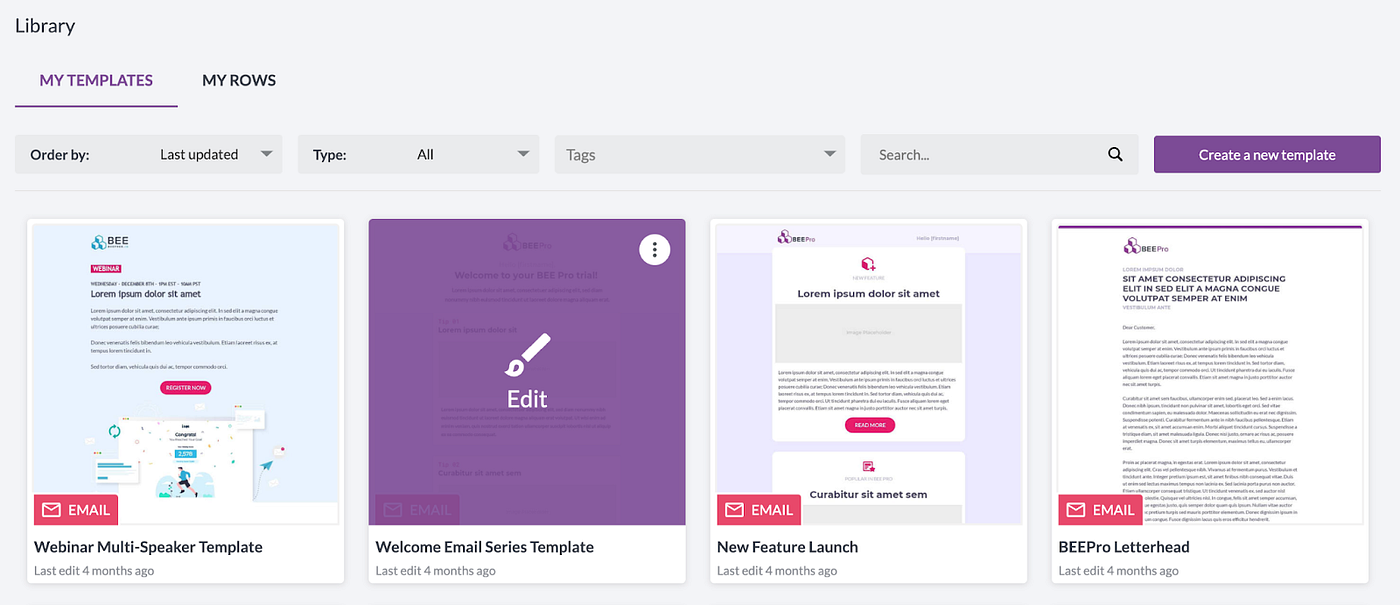
Having a library section where customers find all their saved templates makes it easier for them to remember how to manage them.
Quick links list:
- Beefree Templates: https://beefree.io/templates/
- Using templates and messages: a sample workflow
1.2 Saved rows as template building blocks
Templates can help users save time. But, the outcome can limit creative initiative, hence forcing the content to suit a very rigid structure.
We’ve seen designers create modular layouts within a template, which usually includes multiple blocks following meticulous brand guidelines.
However, this approach has several flaws:
- Templates are too long and complex to work with (approx. ten times heavier than they should be).
- Templates are too complex to maintain in the case of different versioning.
- Content editors had to edit the template directly, and this process is error-prone. If users delete something by mistake, they most likely have to start the campaign design process all over again.
A more modular approach to templates is required to streamline the design process and make it more user-friendly.
The solution we came up with is to break these modular templates into smaller pieces, saving them separately and making them available to your customers when creating a new design.
Your users can build their campaign using saved rows — foundational blocks of a template — to accommodate their needs.

Beefree SDK provides the ability to save rows and feed them into the editor at any time, so adding the proper header or footer is as simple as dragging and dropping it in the desired position.

Designers can update the rows list at any time, so people editing designs will always find the pieces they need to create on-brand content.
And the best part: these saved rows can be used in email, landing pages, or popups, no matter the original source.
Quick links list:
Save Rows:
- Overview: https://devportal.beefree.io/hc/en-us/articles/4408460345618-4-Rows-Overview
- Documentation: https://docs.beefree.io/save-rows/
- Saved Rows Management: https://devportal.beefree.io/hc/en-us/articles/4408926867346-November-2021-Saved-Rows-Management
Edit Single Row:
- Documentation: https://docs.beefree.io/save-rows/edit-single-row-mode/
- Knowledge-Based Article: https://devportal.beefree.io/hc/en-us/articles/4791731372946-March-2022-Single-Row-Editing
2. Setting up the brand styles in the editor
2.1 Intro to editor’s styles
Templates and saved rows provide efficient, reusable designs and branding structure when planning on new content. But, what happens when a user adds new content on top of these predefined elements?
The following section describes how to add predefined styles to speed up the design process when adding new elements. With these simple steps, customers will follow the brand guidelines but still, have the space to experiment while adding creative content.
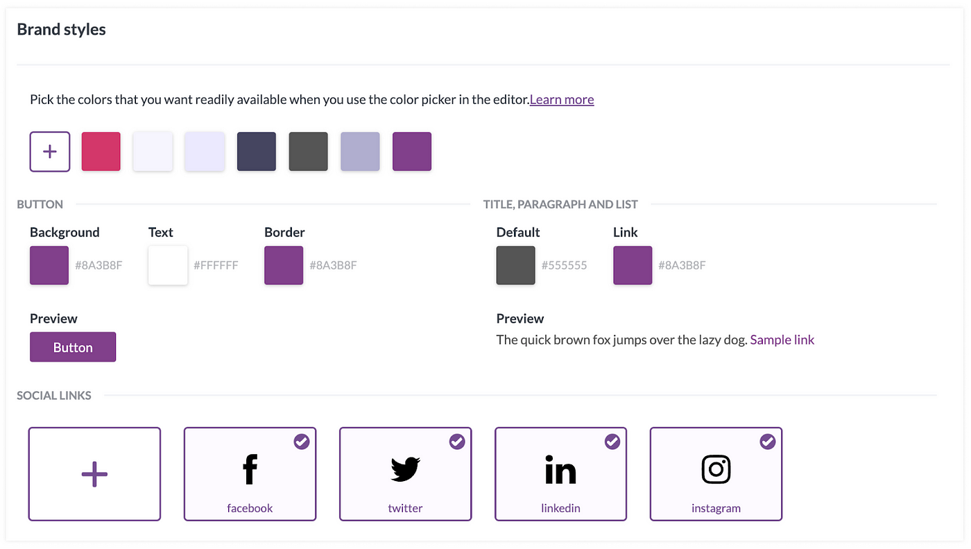
2.2 Setting up the color palette
When the builder loads, the color palette gathers a list of colors created from multiple sources to deliver quick access to color swatches. It’s shown in all the different widgets that use color as an input (font color, row background color, button border color, etc.).

The default behavior for the color palette is the following:
- Display three primary colors from the loaded template.
- Display the seven most recently used colors.
- Display custom colors when defined.
You can disable the first two options and customize the last one to provide an on-brand color palette. Users will still be able to use the color wheel and select contrast colors, but brand colors will always be there to avoid replacements with “similar” colors.
The provisioning team can define color customization by setting up everything the customer needs, but it can be easily provided as a customer-facing setting.

2.3 Applying the Brand Identity with content defaults
The content defaults feature defines how new content blocks will look when dragged into an email, page, or popup. This configuration speeds up the process when adding new content and guarantees that brand styles are not missed.
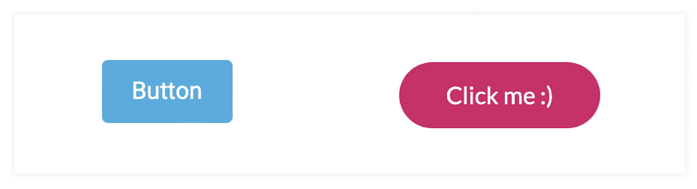
By creating an interface where your customers can pick default elements, you can help them facilitate the implementation of brand guidelines, like font family, text color, button shape, or even the default text to be used.
Content default settings are available for all the content blocks. It’s up to you to define how much brand control you want to provide your customers. We recommend including all the text-based content blocks and the button one.
The same happens with the granularity of the styles. You can limit it to the main ones or go deep into the content block properties and define sophisticated settings like the container block padding.
Examples:


Quick link:
- Content Defaults: https://docs.beefree.io/content-defaults/
This article touches on how Beefree SDK can enable your customers to protect their brand while making design accessible to all. Stay tuned for the second in-depth article focused on helping your customers stay on brand with advanced permissions.
What are you waiting for? Get started today!
With these features, you can provide users with a more efficient way of working and give them more time to spend on what matters the most for them. Book a demo today and see for yourself how Beefree SDK can help your business.

.png)
.png)


